Overview
Through my internship at Raybourn Group International, I was tasked with many projects that grew me as a designer. This conference branding was one of them that took most of my time getting perfect.
Approach
As I played around with sketches and research, I had a lot of ideas in my head about where the branding could go. They gave me terms and ideas to go off of and I took those and brought them fresh looking ideas when they were stuck in the mud.
The Logo Itself
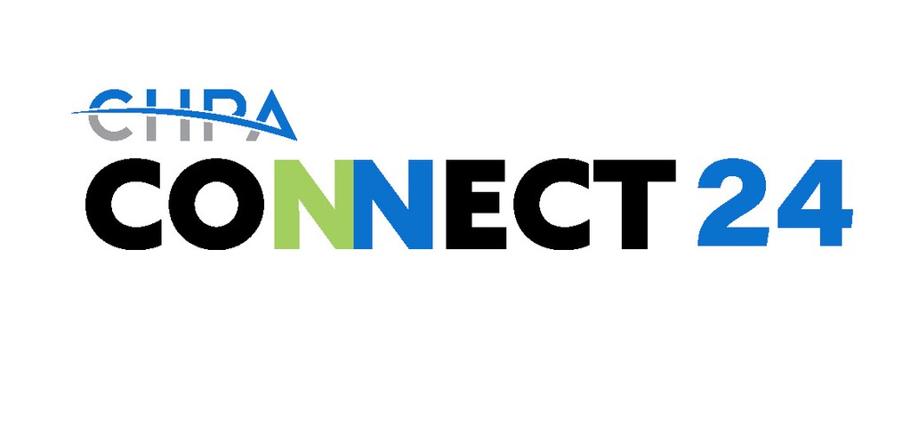
This was the final logo. The more I work on the logo and created ideas from what they asked, they kept coming back to simplicity. I was quite reminded and brought back to design 101 class, logos need to be simple and easy to identify. Its a simple 'connection" of the two letter n's in connect. They could not have been more happy with this direction and we finally had our winner.
Marketing Graphics
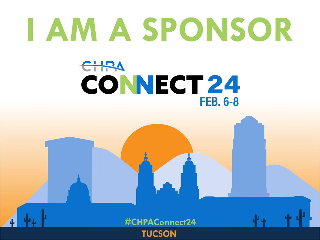
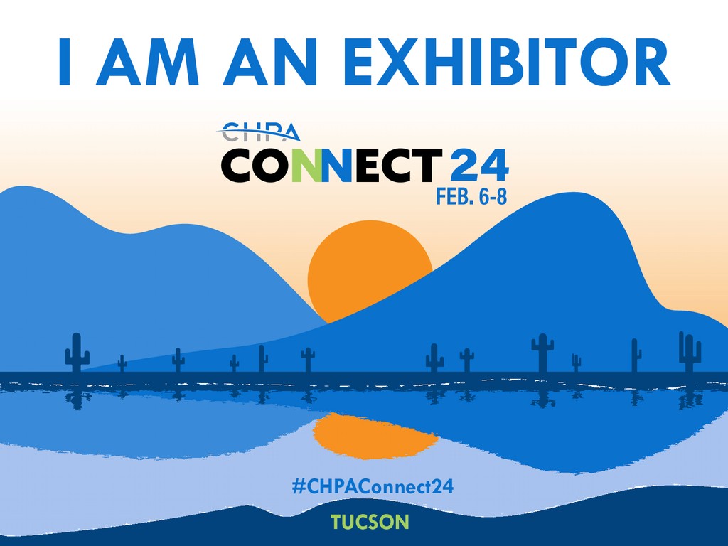
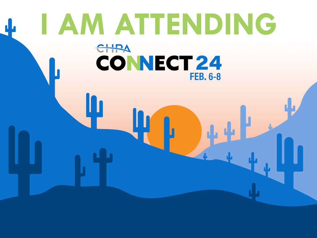
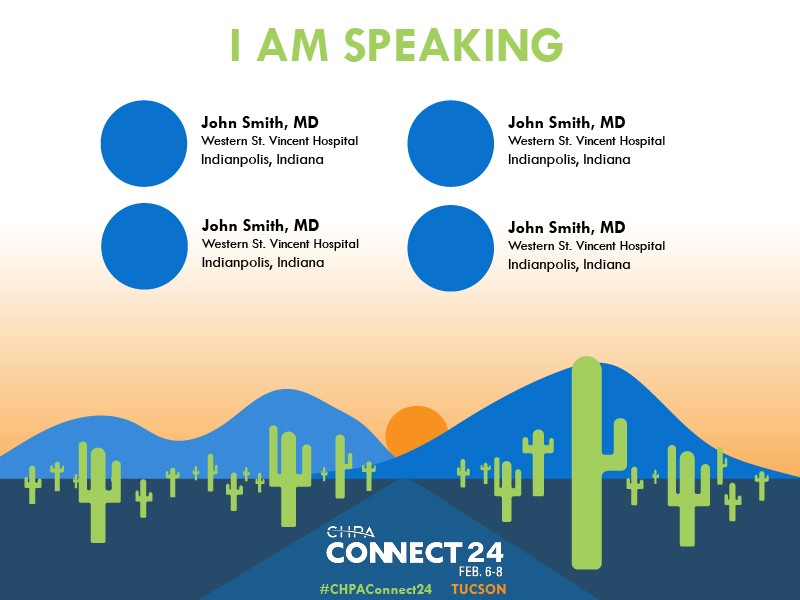
These graphics are digitally crafted and illustrated by me to encapsulate the Arizona sun where the conference was going to be at. Each one different parts of the city and its suburbs.
